Metropolitan Areas
The following plots and maps focus on all of Missouri’s metropolitan statistical areas (MSA). These areas include portions of Illinois (in the case of the Cape Girardeau and St. Louis metros), Kansas (in the case of the Kansas City and St. Joseph metros), and Oklahoma (the Joplin metro). The FAQ contains more details about what constitutes a MSA.
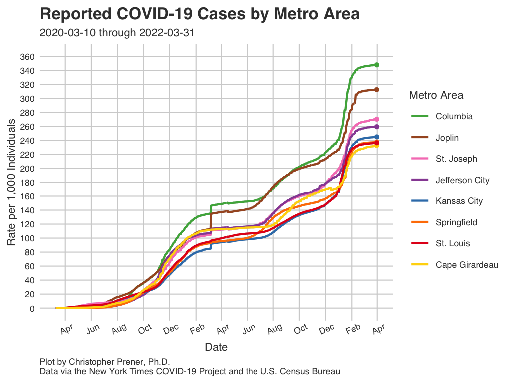
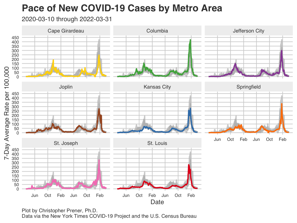
Infections
These plots show patterns in infections for all of Missouri’s metro areas.
Data Table
Notes
- The underlying data for these plots are available from GitHub in the
county_full.csvtable, which is assembled from data provided by the New York Times. - The FAQ contains short explanations of per-capita rates and log plots.
- All averages presented are 7-day rolling averages.
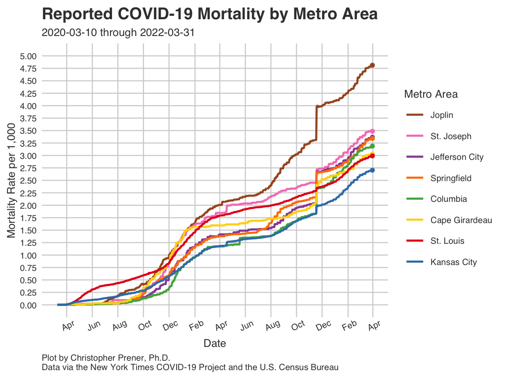
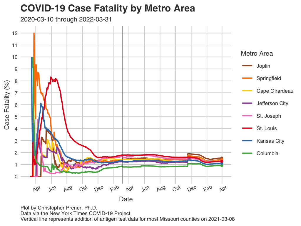
Mortality
These plots show patterns in mortality for all of Missouri’s metro areas.
Data Table
Notes
- The underlying data for these plots are available from GitHub in the
county_full.csvtable, which is assembled from data provided by the New York Times. - The FAQ contains short explanations of per-capita rates and log plots.
- All averages presented are 7-day rolling averages.
- The abbreviation “CFR” states for case fatality rate (the number of deaths divided by the number of known cases, expressed as a percentage).
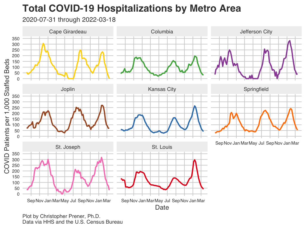
Hospitalizations
These plots show patterns in hospitalizations for all of Missouri’s metro areas. The federal government only began collecting these data systematically in mid-summer, and so these data do not reflect hospitalization patterns at the beginning of the pandemic.
Data Table
Copyright © 2020-2021 Christopher Prener, Ph.D. All code, data, website content, and images are available under a Creative Commons Attribution 4.0 International License.