Nursing Homes
COVID-19 has been implicated in substantial morbidity and mortality in nursing home residents since the onset of the outbreak in the United States. However, it is still unknown as to how the cases are distributed geographically and if clusters are correlated with overall geographic burden of COVID-19 cases. Moreover, the State of Missouri and local county health departments have refused, generally, to name nursing homes and long term care facilities (LTCs) associated with COVID-19 outbreaks. Using the Centers for Medicare and Medicaid Services (CMS) nursing home COVID-19 data set, which is publicly available, my colleague Timothy Wiemken and I have put together the following maps and tables that illustrate the extent of COVID-19 within facilities and relative to the counties these facilities reside in.
Missouri Overview
As of 2022-02-20, a total of 62314 cases have been reported in Missouri nursing homes and LTCs. These represent 4.39% of all cases reported to date in Missouri. Of these cases, 32301 have occurred among residents and 30013 have occurred among staff.
In terms of mortality, a total of 4210 deaths have been reported in Missouri nursing homes and LTCs. These represent 21.57% of all deaths reported to date in Missouri. Of these deaths, 4142 have occurred among residents and 68 have occurred among staff.
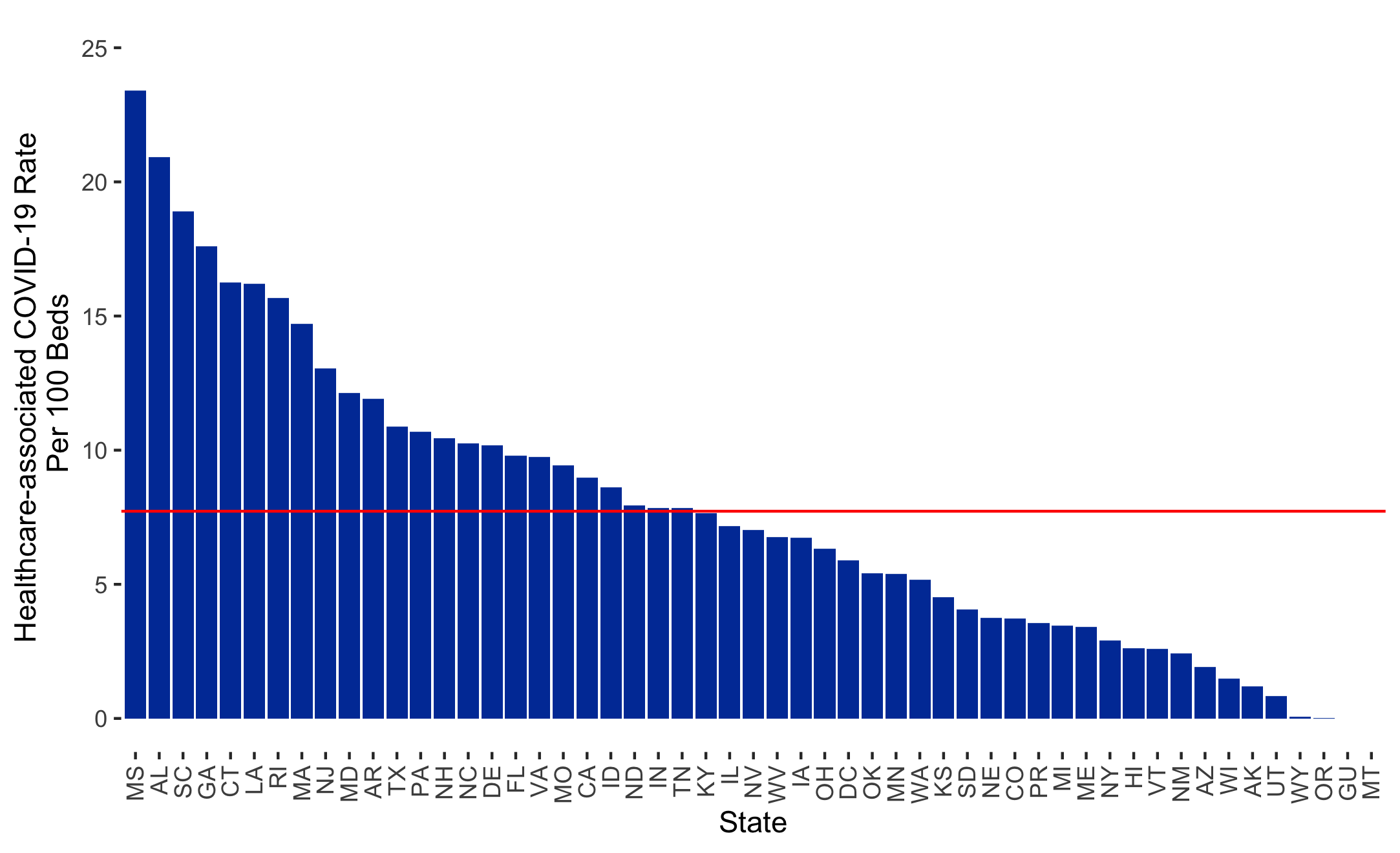
State Comparisons
Health care transmission of SARS-CoV-2 has been documented but it is unknown as to how much transmission is occurring in nursing homes. The plot below depicts one approach to exploring this issue. Here, we subtracted the aggregate total admissions with COVID-19 from the total resident COVID-19 cases by state to approximate transmission. Dividing by the total number of nursing home beds in a state allows a more standardized rate-based evaluation of health care-associated COVID-19 transmission. The red line is the average, meaning Missouri is slightly above average.
Static Plot
Data Table
Morbidity
The following maps track confirmed case rates by facility, new case rates in the last two weeks, and compare facility rates to county rates.
Cases by Facility
This map shows the rate of confirmed COVID-19 cases per 100 beds at each LTC facility. The size of each circle is related to the rate - the larger the size, the higher the rate per 100 beds. It is possible for a facility to have a rate higher than 100 because our calculation also includes staff cases and because of resident turnover. The pop-up associated with each circle will reveal facility details as well as a breakdown of resident and staff cases.
Interactive Map
Data Table
New Cases by Facility
This map shows the rate of new, confirmed COVID-19 cases per 100 beds at each LTC facility. These are cases added at the facility in the last two weeks. For the purposes of this report, this is the period between NA and NA. The size of each circle is related to the rate - the larger the size, the higher the rate per 100 beds. The pop-up associated with each circle will reveal facility details as well as a breakdown of resident and staff cases.
Interactive Map
Data Table
Cases by County
This map shows the number of cases in LTC facilities as a percentage of the total number of cases reported by individual counties. There is a temporal mismatch here - the LTC data are from 2022-02-20 while the county case data are from 2022-03-08. This is done to compensate for difference reporting practices and time lines between the two data sets. The pop-up associated with each county will reveal counts as well as a breakdown of resident and staff cases.
Interactive Map
Data Table
Mortality
The following maps track confirmed mortality rates by facility, new mortality rates in the last two weeks, and compare facility rates to county rates.
Deaths by Facility
This map shows the rate of confirmed COVID-19 deaths per 100 beds at each LTC facility. The size of each circle is related to the rate - the larger the size, the higher the rate per 100 beds. It is possible for a facility to have a rate higher than 100 because our calculation also includes staff deaths and because of resident turnover. The pop-up associated with each circle will reveal facility details as well as a breakdown of resident and staff deaths.
Interactive Map
Data Table
New Deaths by Facility
This map shows the rate of new, confirmed COVID-19 deaths per 100 beds at each LTC facility. These are deaths added at the facility in the last two weeks. For the purposes of this report, this is the period between NA and NA. The size of each circle is related to the rate - the larger the size, the higher the rate per 100 beds. The pop-up associated with each circle will reveal facility details as well as a breakdown of resident and staff deaths.
Interactive Map
Data Table
Deaths by County
This map shows the number of deaths in LTC facilities as a percentage of the total number of deaths reported by individual counties. There is a temporal mismatch here - the LTC data are from 2022-02-20 while the county case data are from 2022-03-08. This is done to compensate for difference reporting practices and time lines between the two data sets. The pop-up associated with each county will reveal counts as well as a breakdown of resident and staff deaths.